App store screenshot examples and inspiration


If you're like me, making app store screenshots is often the last you I think of when you're about to submit a new app release.
You have to fire up App Store Connect, eager to hit Submit for Review, and you realize you're not even close to done: The screenshots are missing. And after App Store Connect—you probably have to get them adapted for the Play Store. It looks like you're not launching today after all.
Well, luckily, someone else has been there before you! More than a million app developers and designers, to be more precise. And the best screenshots are just delicious.
We collected more than 600 screenshots from the top of the app stores and put them all in one place, so we could easily pick a design pattern that fits our style and taste.
And now, we're making the collection available for everyone. So say hello to the App Store Assets Best Practice Library. We made this to make it ridiculously easy for you to get a quick jolt of inspiration from popular apps that are delivering millions of downloads every month.
The 230 billion downloads are in the details
The top 100 app developers have done their homework. Here's some of the work they went through to make what you can see in the database today:
- A/B testing of all thinkable combinations
- Hours and hours of design reviews
- Professional copywriters to optimize the promotional copy and the text on the screenshots (almost all top apps use text in their screenshots)
- Amending the designs with inputs from senior designers with a decade of experience in precisely this discipline. So why shouldn't you take advantage of that?
Why do they put so much work into it? Because it works! Creating optimized ASO screenshots can help your brand to...
- Drive more app downloads
- Increase people's trust in their brand
- Drives more engagement like reviews and ratings
When it comes to ASO, the details matter—especially if you happen to get a lot of traffic to your app store product page. And if you nail it, you might get a cut of the more than 250 billion downloads in 2023 (Statista).
The Apps page
One of my favorite views of the screenshot database is the Apps page. We designed it to always show all of an app's images, so you can resize your browser to see them bigger and smaller. And remember, your product page visitors will most likely see them smaller than you think (since they're most likely on their phones).
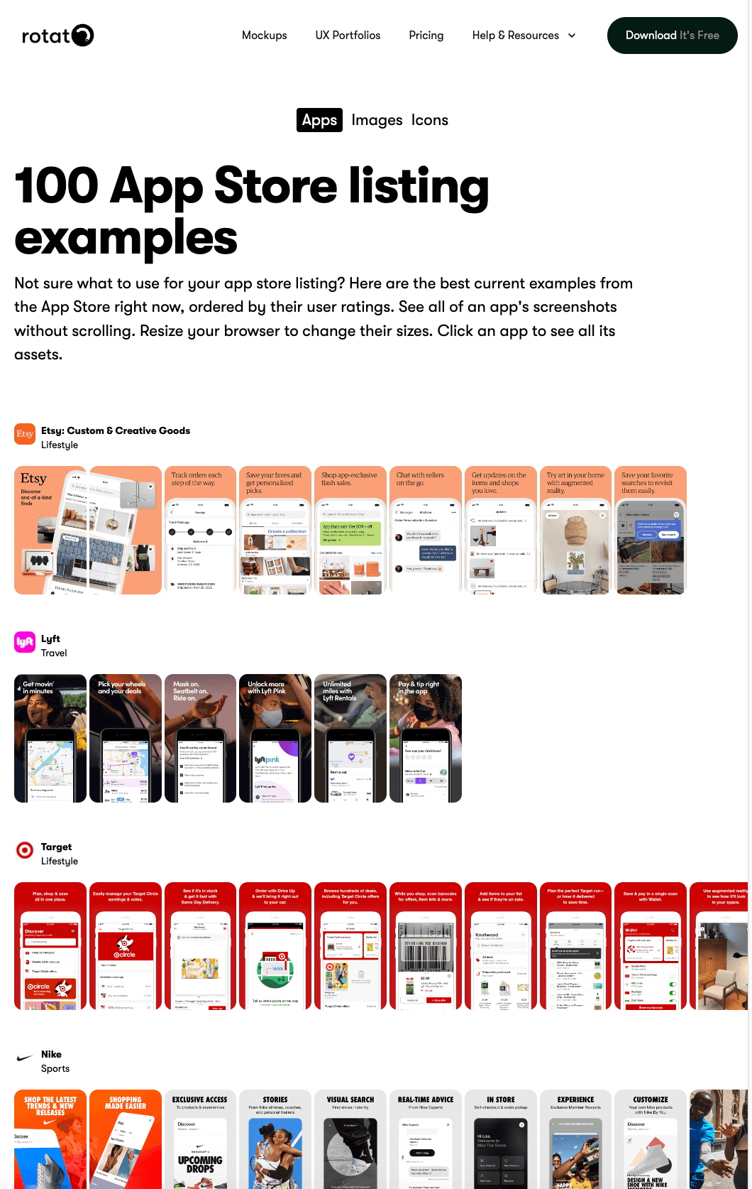
How to create the best app store screenshots for your app
Here are some of the questions this view answers—to help you create the best ASO screenshots:
How many screenshots should I use?
As many as possible, it can't hurt. iOS App Store lets you upload 10, while Google Play Store has a limit of 8.
However, pay extra attention to the first 2 to 3 screenshots, as very few people will side-scroll to see more. Highlight key features, pain points you're solving—and why people should click download.
Should I add connected graphic elements between the screenshots?
It's a fun idea, and some think it motivates people to scroll and see more, but we haven't been able to find data that backs that up, so maybe don't go too overboard in this if you're in a hurry. And it's absolutely not a must-have.
Should I add text to my screenshots? How much?
Yes, and not a lot! People will see the screenshots on a small screen, so make sure your words and sentences are short and to the point. Make sure that the font is big and legible as well.
Some designers see the screenshot text as an opportunity to add their most important message in big type, almost like ten mini ads.
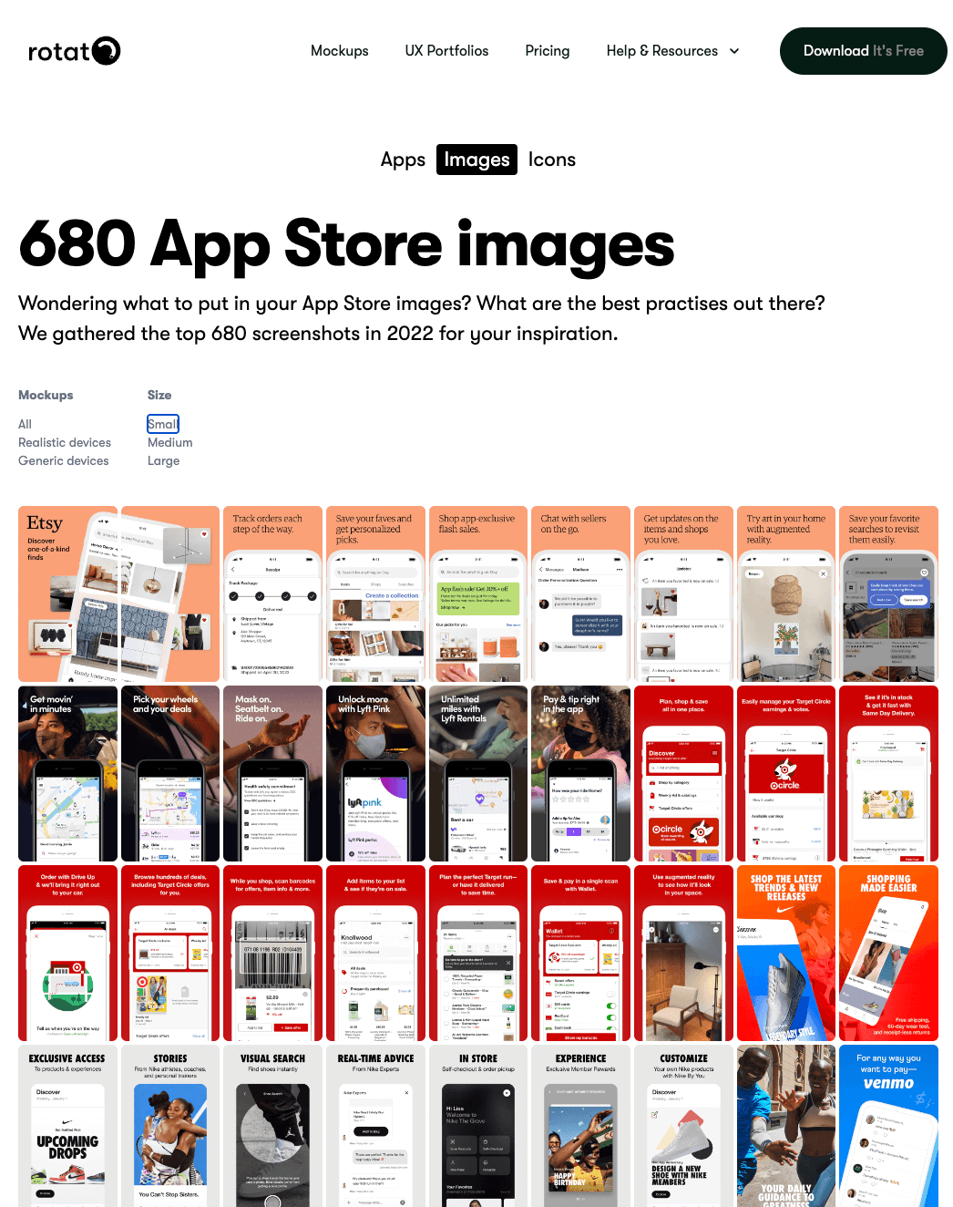
The Images page
Check out the "Images" page to test which kind of screenshots stand out from the noise. In this view, you can set the size to small and fill up your entire screen with screenshots.
You can also filter the view by screenshots that use realistic device mockups, generic mockups, and plain screenshots.
Interestingly, we found that approximately 50% of the screenshots use realistic mockups, and very few use just the raw screenshots.
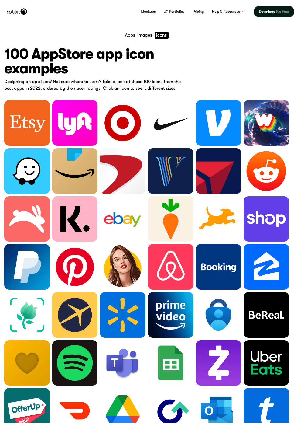
Your app store icon
One piece of launching an app that is worth spending a lot of time on is the good old app icon. The logo. Browsing through this page, it stands out how simple they are—and how simple they have to be. You probably also immediately notice how bright the colors are in 70% of the icons.
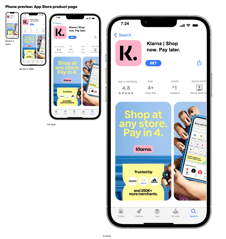
The app page
ASO work is not just optimizing your app screenshots—there's space for the entire description. Once you find a set of app store images you like, dive deeper into their written content. Click on the image or icon to go to the app page, and you'll see a couple of interesting views.
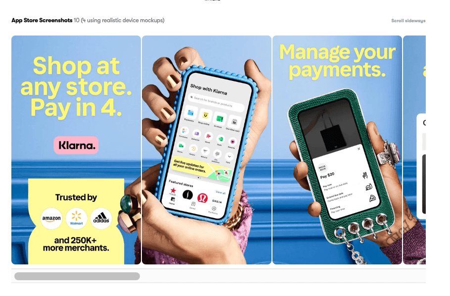
As an example, let's take a closer look at Klarna's app store assets.
Klarna's product page preview
If you're a designer, you've been there: looking at designs that look great on the big screen, but once you see the design in its final habitat, it's...different.
So on the app page, we're simulating real life with a mockup.
- Across the room
- Across a table
- On desk
- In hand
Their full-size screenshots
Design is in the details, so we're also providing the app screenshot images in their full 1:1 pixel size, right below the preview. With this view, you can check out the most delicate details, from the font sizes to the colors that were used.
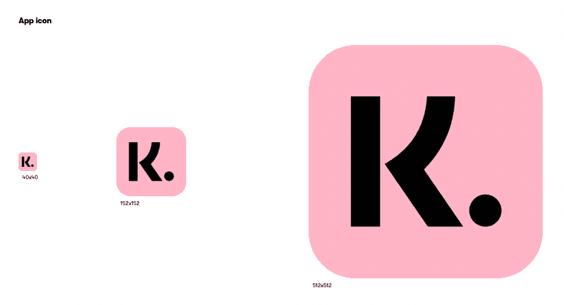
Icon sizes preview
Then there's the icon. So how does an icon like Klarna's work in various sizes? We placed them next to each other in radically different sizes so you can fully grasp the dynamics between big and small and build into your app what you learn.
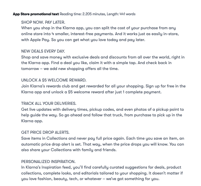
The promotional text
Finally, we show you the full description as provided by the developer. You'll be surprised by how long most of these are. Pay attention to how the text is structured visually. Most developers use bullets—or, like Klarna, super-short paragraphs with all-caps headlines for scannability.
Next steps
So those are the best practices for the App Store Assets Database (long name!) Now go and make some great assets so you can launch that app and get the downloads your app deserves. And if you need a mockup to spice up your app store image, you know where to find them.